Tender concept · capability demonstrationNot a client project · mockup content is illustrative

Tender concept · Capability demonstration

A website older people can actually use.

Our design concept for a tender for a trilingual public website for a community healthy-ageing programme. The tender asked for 13 design deliverables with WCAG 2.2 Level AA as the target. We drew all 13 — most at a higher fidelity than asked — on one design system.

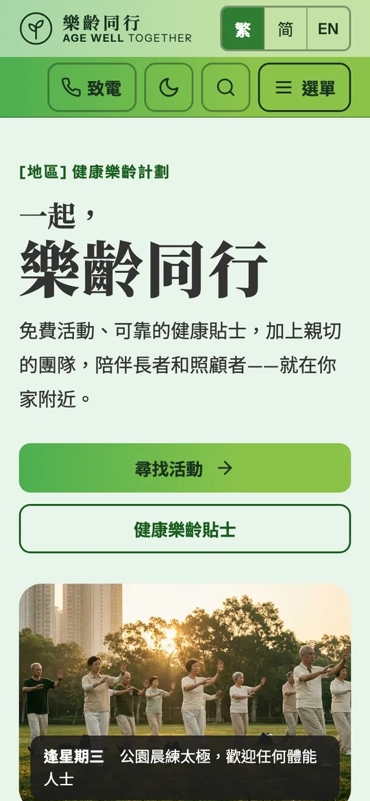
Illustrative mockup of the homepage at desktop 1440, in EnglishIllustrative mockupIllustrative mockup of the homepage at mobile 390, in Traditional ChineseIllustrative mockup
Illustrative mockup: the homepage, desktop (English) and mobile (繁體中文). The name, activity and photographs are placeholders — stock imagery, not programme participants or venues.

1 · The brief

Most of the audience will never fill in a form.

The people a programme like this serves often read slowly, tap carefully and browse on a small phone, in Cantonese. Many prefer to call. Carers arrive in a hurry, looking for one answer.

So large text, big targets, plain language and a phone number in reach are the design itself — on every page, in three languages.

What this is
Our design concept for a tender for a community healthy-ageing programme website
Audience
Older adults, family carers, and the professionals who refer them
Mockup content
Illustrative only — the working name, logo, activities, dates, people, credentials and photographs are placeholders, not approved project content
Stage
Tender concept only. Not awarded, not a client engagement, no live site. The organisation is not named
Accessibility
WCAG 2.2 Level AA is the design target. Not audited or certified — the built site is tested, with a conformance report before UAT
Languages
English, Traditional Chinese and Simplified Chinese
What the concept covers
Sitemap, wireframes, high-fidelity desktop and mobile pages, navigation, style guide and components

What the tender asked for

Thirteen deliverables. All thirteen drawn as concepts.

The checklist below is the tender’s own list, with the fidelity and priority it set. The sections that follow show each one, in the order a visitor meets them. Every board is an illustrative mockup, not approved content.

Tender deliverables: fidelity and priority asked for, and the concept drawn for each
#RequirementAsked forPriorityStatus
1Sitemap / information architectureDiagram做 · RequiredConcept drawn
2Homepage — desktopHigh-fidelity一定做 · Must haveConcept drawn
3Homepage — mobileHigh-fidelity一定做 · Must haveConcept drawn
4Desktop navigationHigh-fidelity / component做 · RequiredConcept drawn
5Mobile navigationHigh-fidelity / component做 · RequiredConcept drawn
6Standard content pageWireframe建議 · RecommendedConcept drawn
7News / article detailWireframe建議 · RecommendedConcept drawn
8Event / resource listingWireframe建議 · RecommendedConcept drawn
9Resource detailWireframe可選 · OptionalConcept drawn
10Contact不需要完整設計 · Full design not required不急 · Not urgentConcept drawn
11Search results不需要完整設計 · Full design not required不急 · Not urgentConcept drawn
12404不需要完整設計 · Full design not required不急 · Not urgentConcept drawn
13UI / accessibility componentsHigh-fidelity sample做 · RequiredConcept drawn
—Accessibility: WCAG 2.2 Level AARequest—Design target — not audited

2 · Information architecture

Nobody gets lost — the same way round, every page.

Before any page was drawn, the information architecture fixed where everything lives and how people reach it: the sitemap, the content model, the URL and language pattern, the navigation, and the journeys it was checked against.

Requirement 1: Sitemap / information architecture

Asked: Diagram做 · RequiredConcept drawn

Four sections, never more than two levels deep, mirrored in 繁 / 简 / EN. Every page is at most two clicks from Home. Thirteen content types feed the thirteen templates, and three journeys are checked against the tree.

Boards: 01 Information architecture, parts 1 and 2 — shown in full below
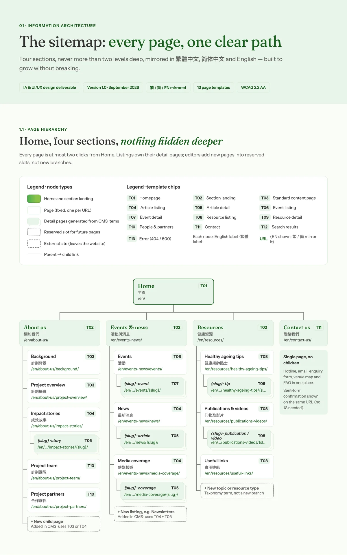
1.1 Page hierarchy — Home, four sections, every page and URL
Illustrative mockup — Sitemap: Home with four sections — About us, Events & news, Resources, Contact us — each page with its template number and URLIllustrative mockup
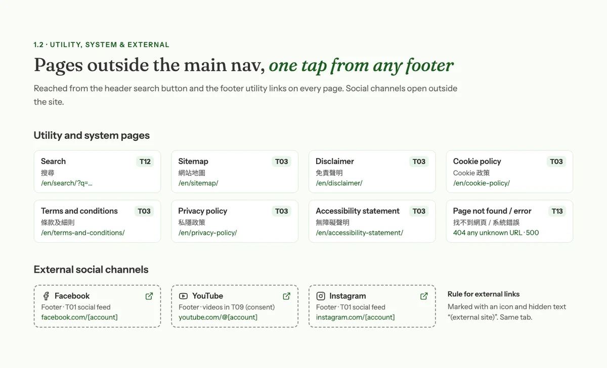
1.2 Utility, system and external pages
Illustrative mockup — Utility and system pages reached from the footer and search, and the external social channelsIllustrative mockup
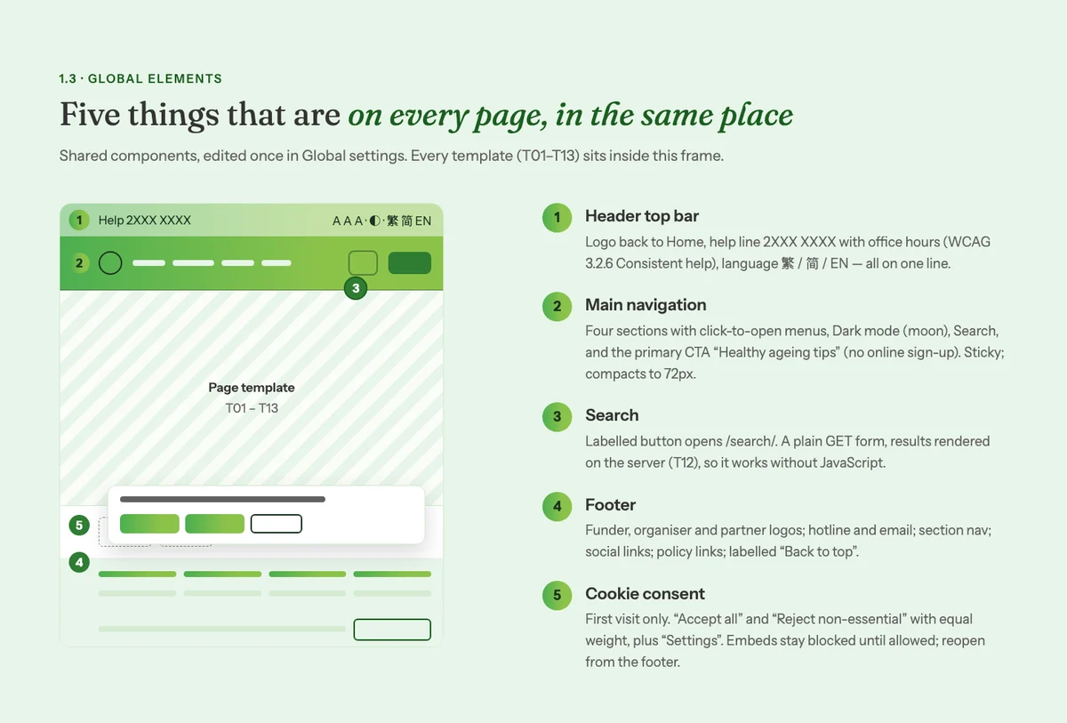
1.3 Global elements on every page
Illustrative mockup — The five elements on every page: header top bar, main navigation, search, footer and cookie consentIllustrative mockup
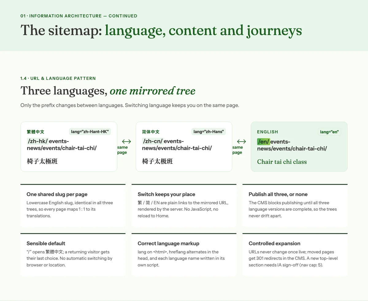
1.4 URL and language pattern
Illustrative mockup — One mirrored URL tree for Traditional Chinese, Simplified Chinese and English; switching language keeps you on the same pageIllustrative mockup
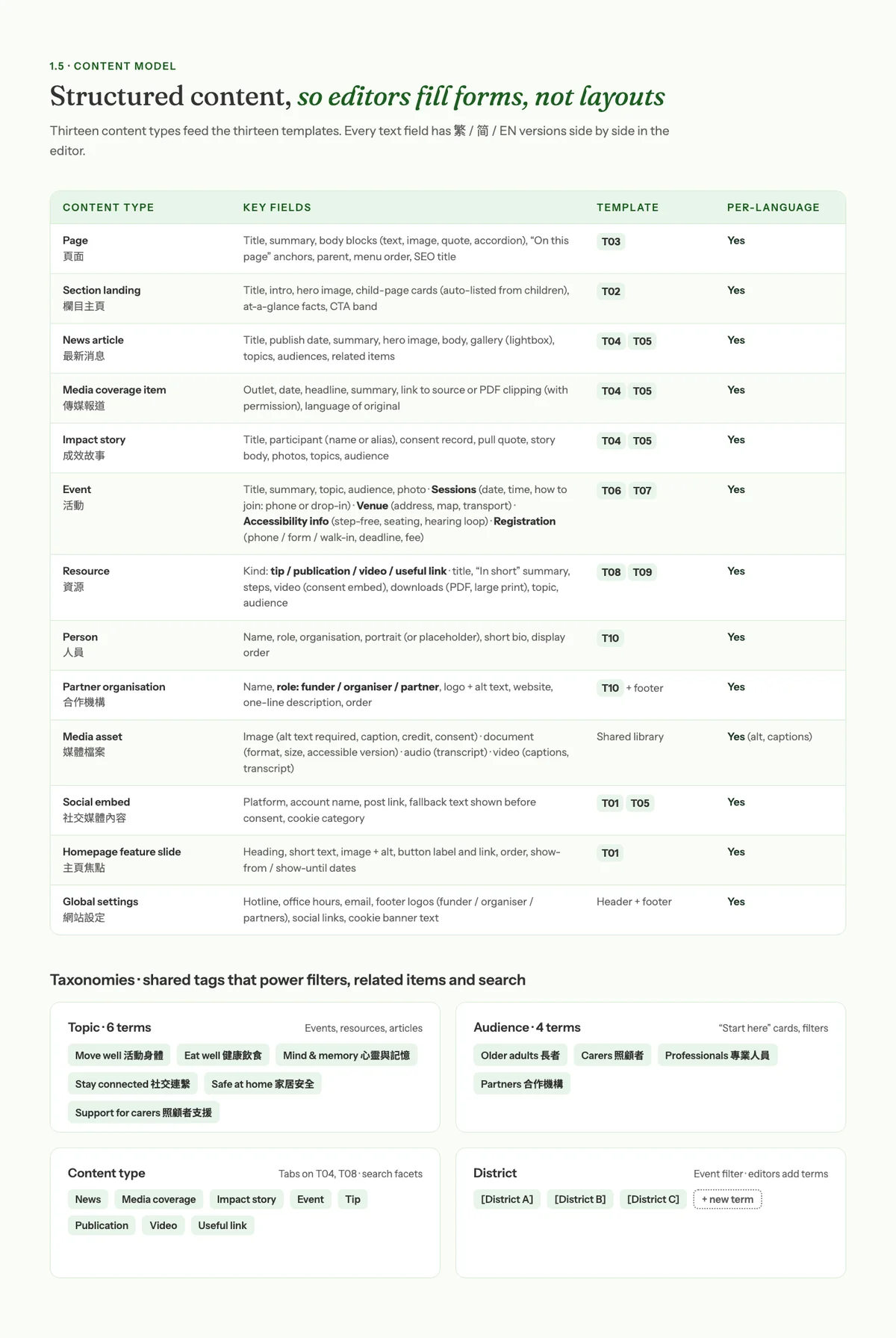
1.5 Content model and taxonomies
Illustrative mockup — Content model table: thirteen content types with their key fields, templates and per-language versions, plus the topic, audience, content-type and district tagsIllustrative mockup
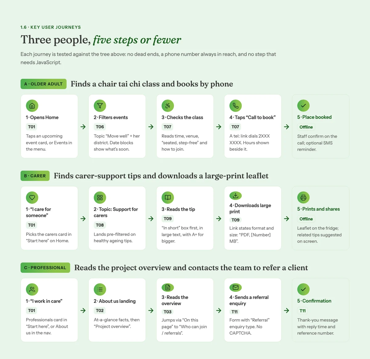
1.6 Key user journeys
Illustrative mockup — Three user journeys in five steps or fewer: an older adult books a class by phone, a carer downloads a large-print leaflet, a professional sends a referralIllustrative mockup

Requirement 4: Desktop navigation

Asked: High-fidelity / component做 · RequiredConcept drawn

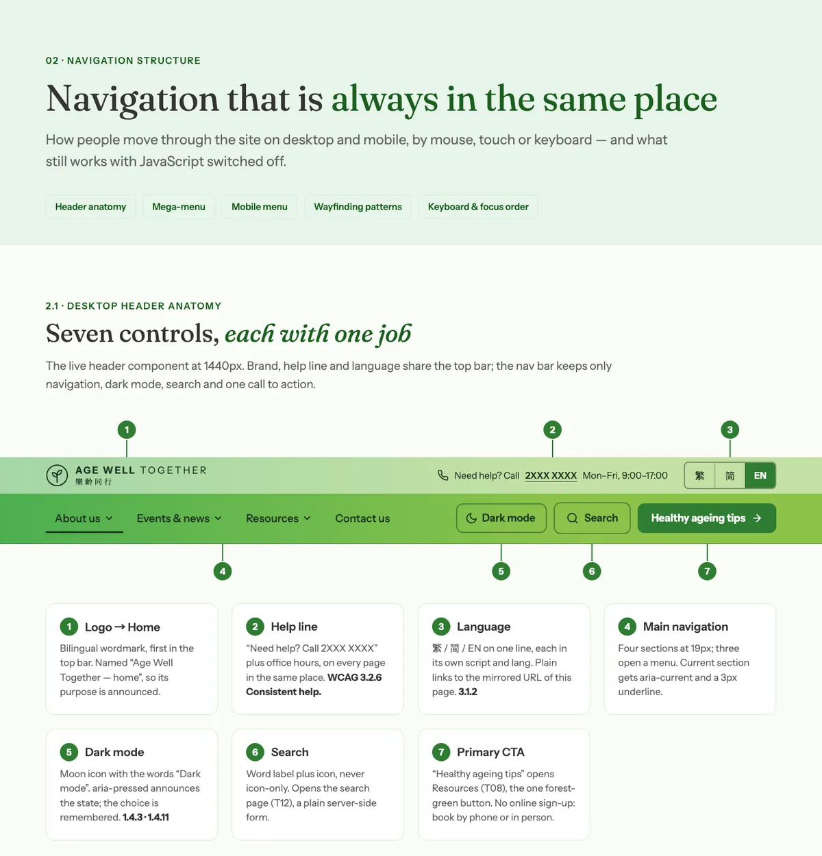
Seven header controls, each with one job: logo, help line, language, main menu, dark mode, search and one call to action.

Boards: 02 Navigation structure (mega menu) and Component · Header desktop

Illustrative mockup — Navigation board: the desktop header with its seven numbered controls explainedIllustrative mockup

Requirement 5: Mobile navigation

Asked: High-fidelity / component做 · RequiredConcept drawn

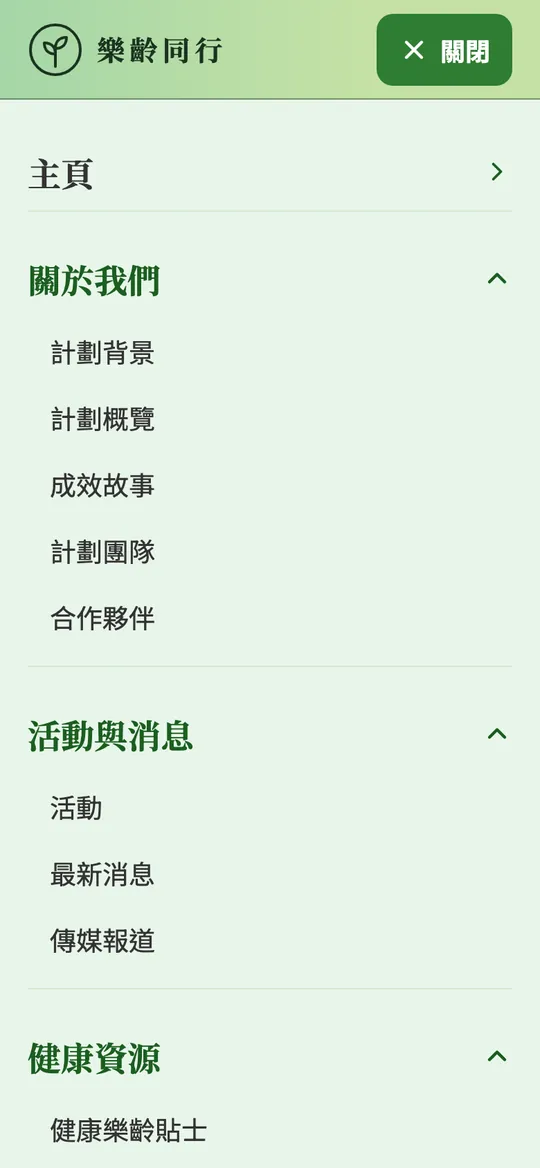
A labelled 選單 button opens an accordion menu with large rows, the language switch and the hotline at the bottom.

Boards: Mobile menu open (from 選單) and Component · Header mobile

Illustrative mockup — Mobile menu open, in Traditional Chinese, with sections, language switch and call buttonIllustrative mockup

3 · The pages — homepage

The front door, at desktop and mobile.

The two deliverables the tender marked “must have”, both at high fidelity.

Requirement 2: Homepage — desktop

Asked: High-fidelity一定做 · Must haveConcept drawn

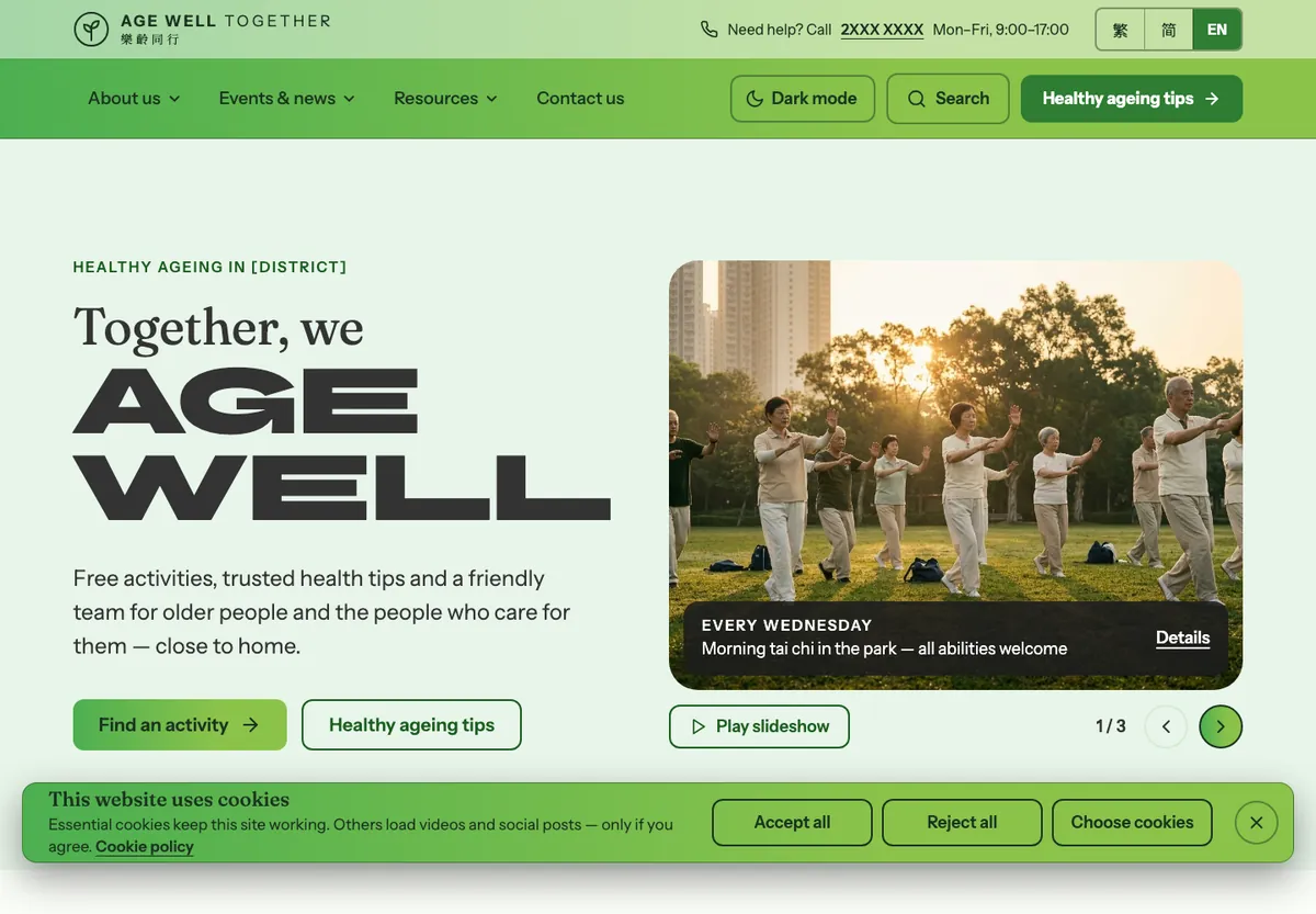
One clear message, two actions, a slideshow that only moves when asked, and the cookie choice up front.

Boards: T01 Homepage desktop 1440 (EN), plus its continuation

Illustrative mockup — Homepage at desktop 1440, English: hero with “Together, we Age Well”, two buttons and a paused slideshowIllustrative mockup

Requirement 3: Homepage — mobile

Asked: High-fidelity一定做 · Must haveConcept drawn

The same page at 390px in Traditional Chinese — call, dark mode, search and menu always in reach.

Boards: T01 Homepage mobile 390 (繁), plus its continuation

Illustrative mockup — Homepage at mobile 390, Traditional ChineseIllustrative mockup

3 · The pages — templates

Wireframe first, then the real page.

The brief asked for wireframes here. We drew the wireframes, then designed each template at high fidelity, desktop and mobile.

Requirement 6: Standard content page

Asked: Wireframe建議 · RecommendedConcept drawn

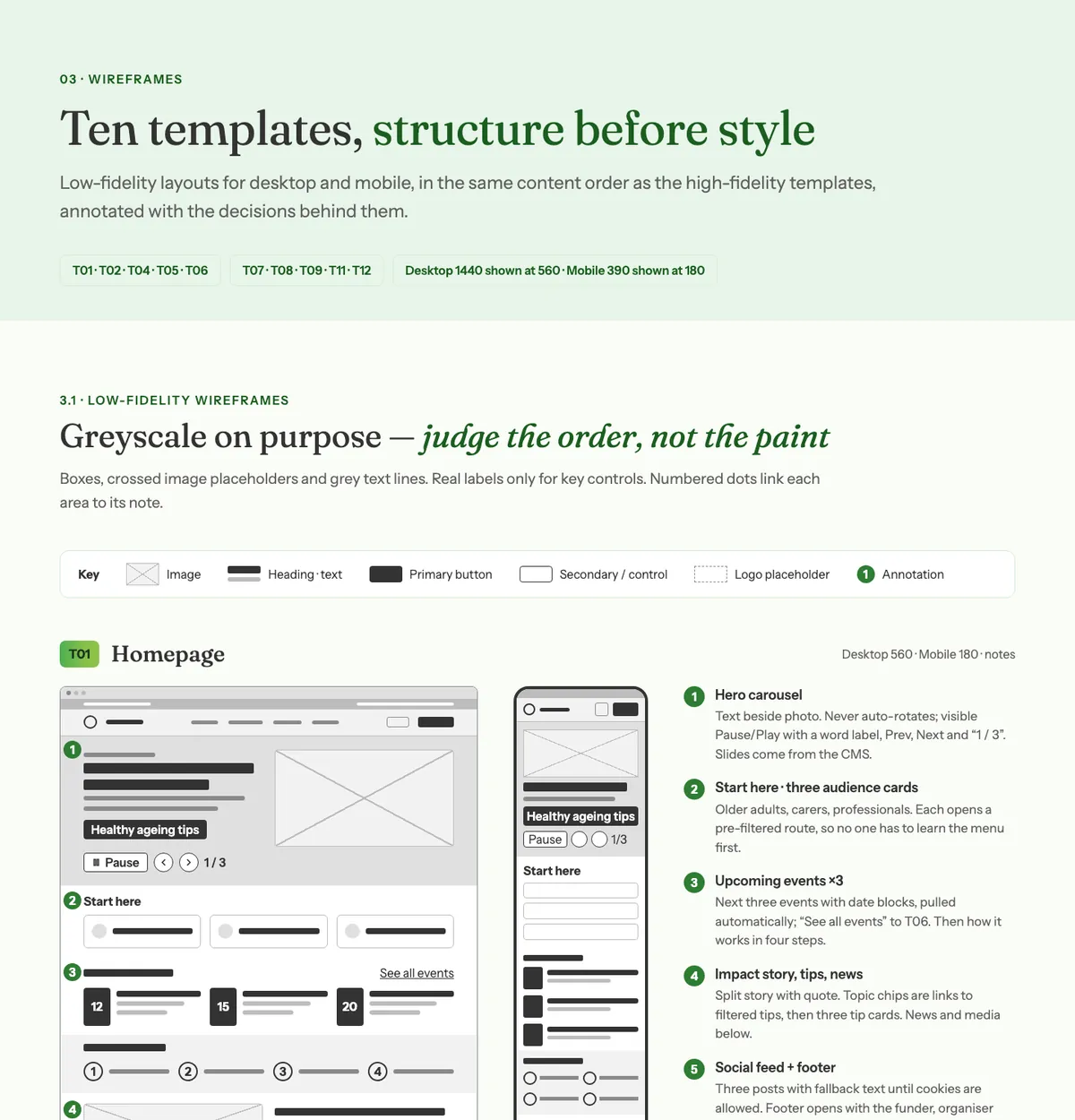
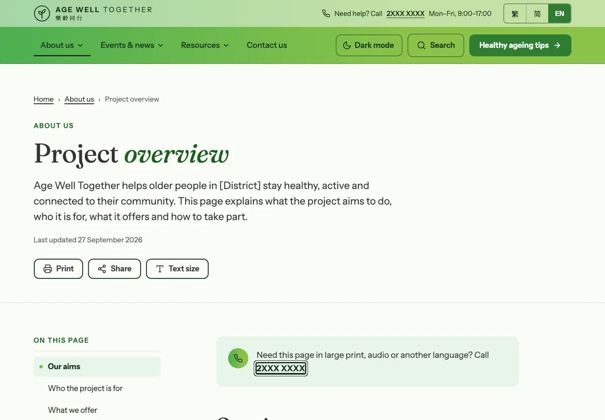
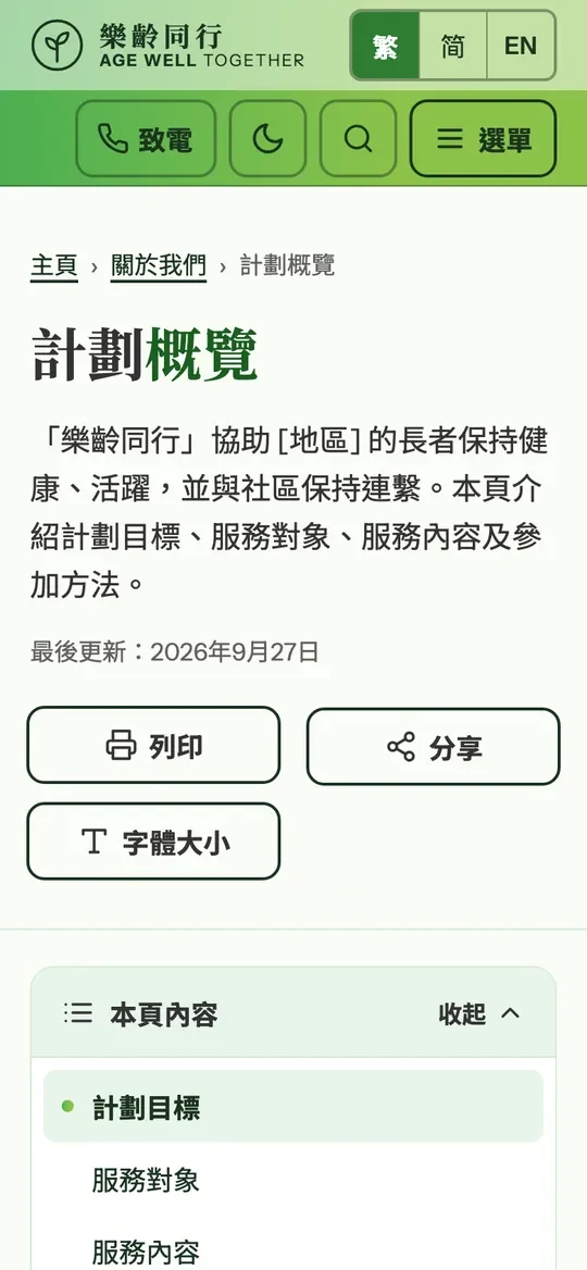
Asked as a wireframe — we drew the wireframe and the high-fidelity page.

Boards: 03 Wireframes and T03 Standard content page, desktop + mobile

Illustrative mockup — Wireframes board: greyscale homepage layout at desktop and mobile with numbered notesIllustrative mockup
Illustrative mockup — Standard content page at desktopIllustrative mockup
Illustrative mockup — Standard content page at mobileIllustrative mockup
Requirement 7: News / article detail

Asked: Wireframe建議 · RecommendedConcept drawn

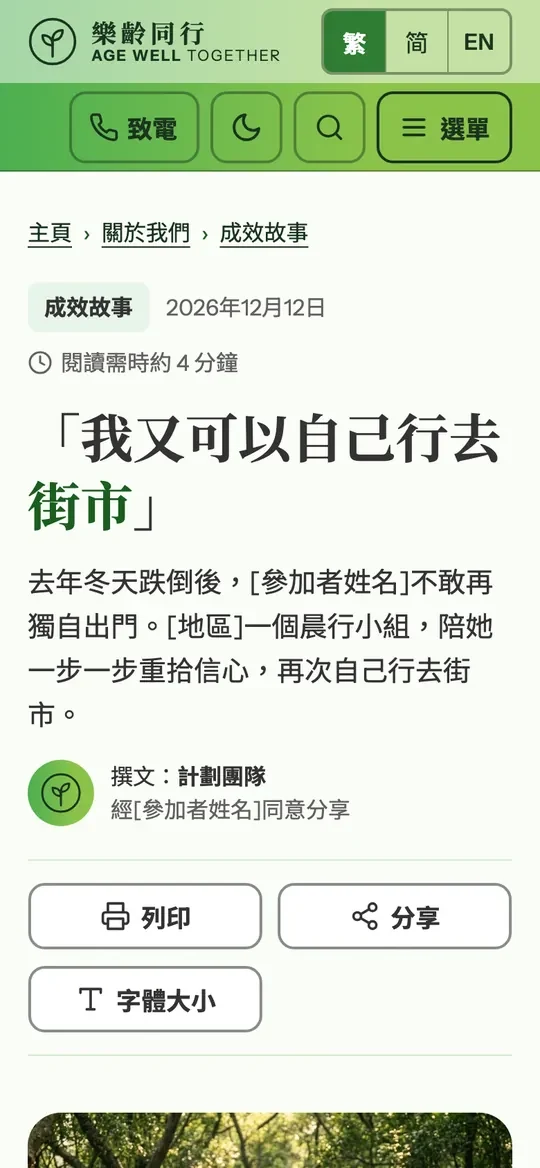
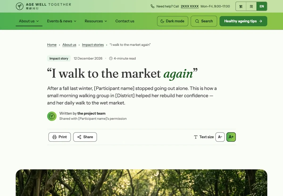
Large reading text, text-size controls and a photo gallery with lightbox.

Boards: 03 Wireframes and T05 Article detail + lightbox, desktop + mobile

Illustrative mockup — Article detail page at desktopIllustrative mockup
Illustrative mockup — Article detail page at mobileIllustrative mockup
Requirement 8: Event / resource listing

Asked: Wireframe建議 · RecommendedConcept drawn

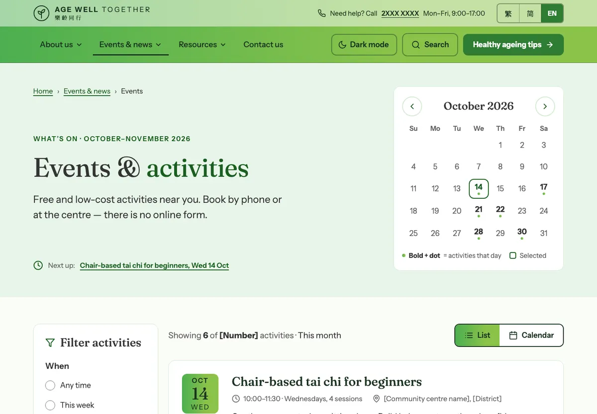
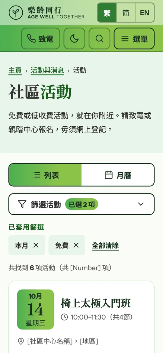
Big date blocks and plain filters. Every event says how to join by phone or in person — no sign-up form. The activities, venues and dates shown are invented examples.

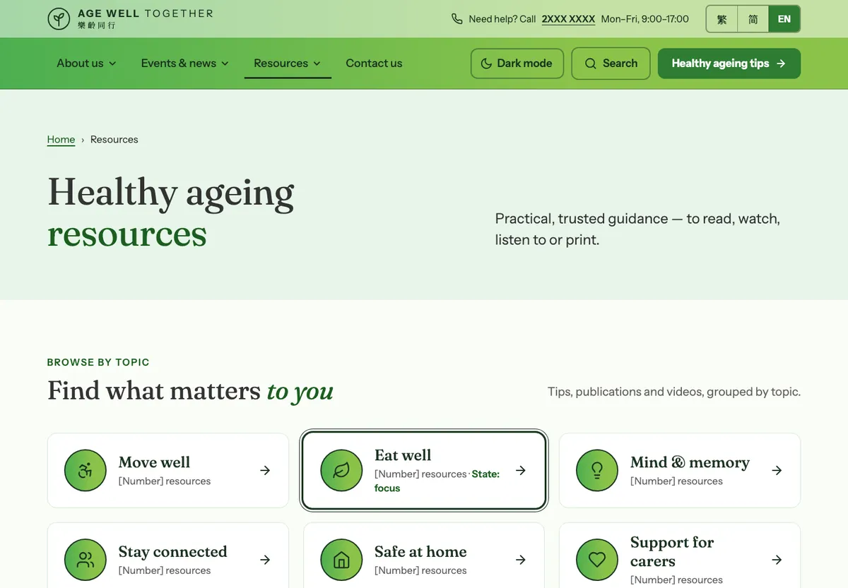
Boards: 03 Wireframes, T06 Event listing and T08 Resource listing, each desktop + mobile

Illustrative mockup — Event listing page at desktopIllustrative mockup
Illustrative mockup — Resource listing page at desktopIllustrative mockup
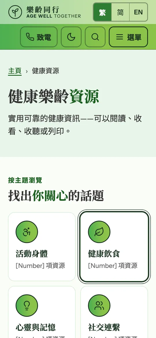
Illustrative mockup — Event listing page at mobileIllustrative mockupIllustrative mockup — Resource listing page at mobileIllustrative mockup
Requirement 9: Resource detail

Asked: Wireframe可選 · OptionalConcept drawn

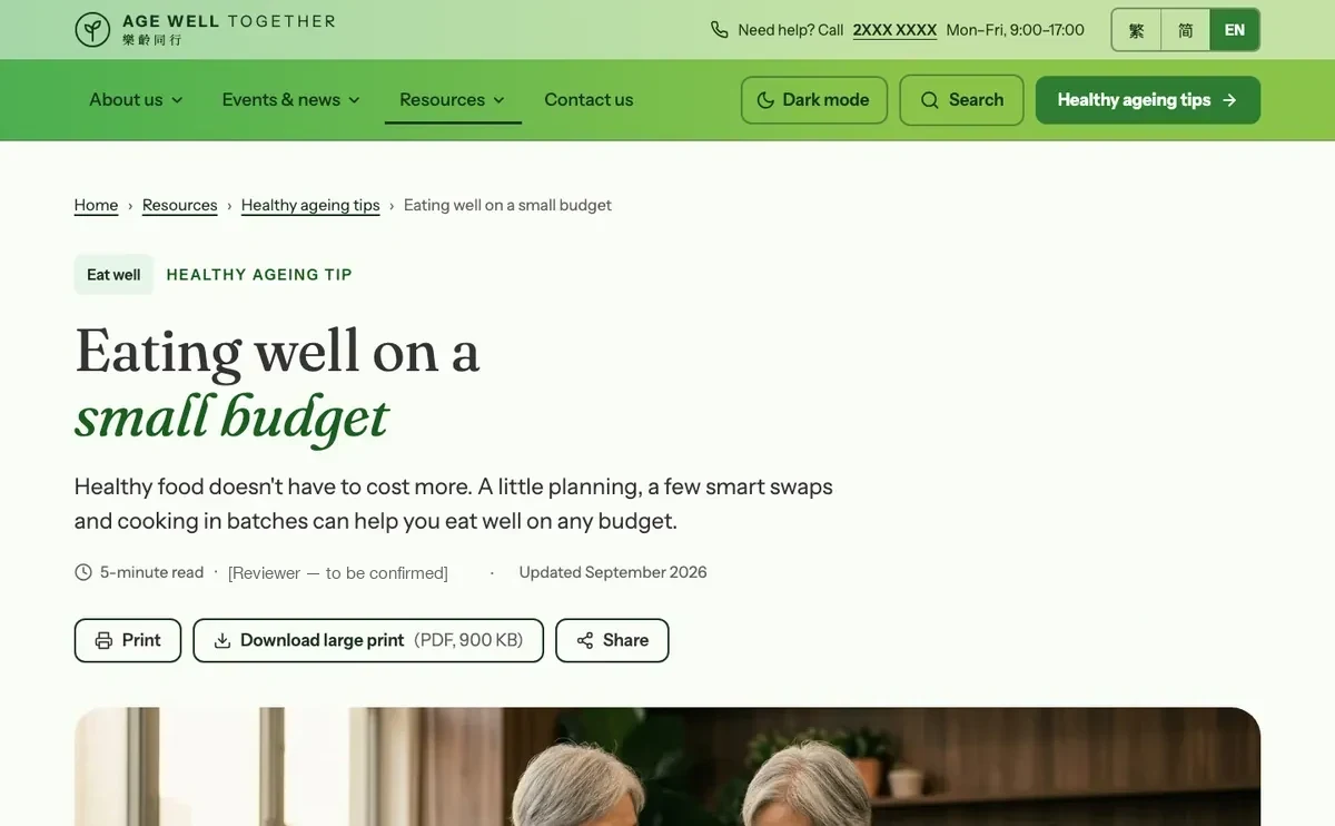
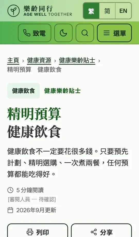
Optional in the brief, drawn in full: large-print download, print and share. The article, its date and its reviewer line are placeholders.

Boards: T09 Resource detail, desktop + mobile

Illustrative mockup — Resource detail page at desktopIllustrative mockup
Illustrative mockup — Resource detail page at mobileIllustrative mockup
3 · The pages — help pages

Not urgent in the brief, designed in full anyway.

Contact, search and error pages are where people who are stuck end up — so they got the same care.

Requirement 10: Contact

Asked: 不需要完整設計 · Full design not required不急 · Not urgentConcept drawn

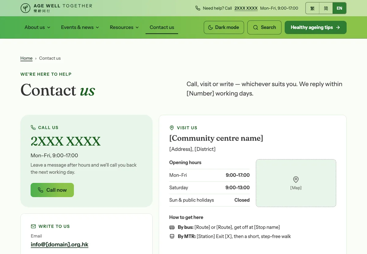
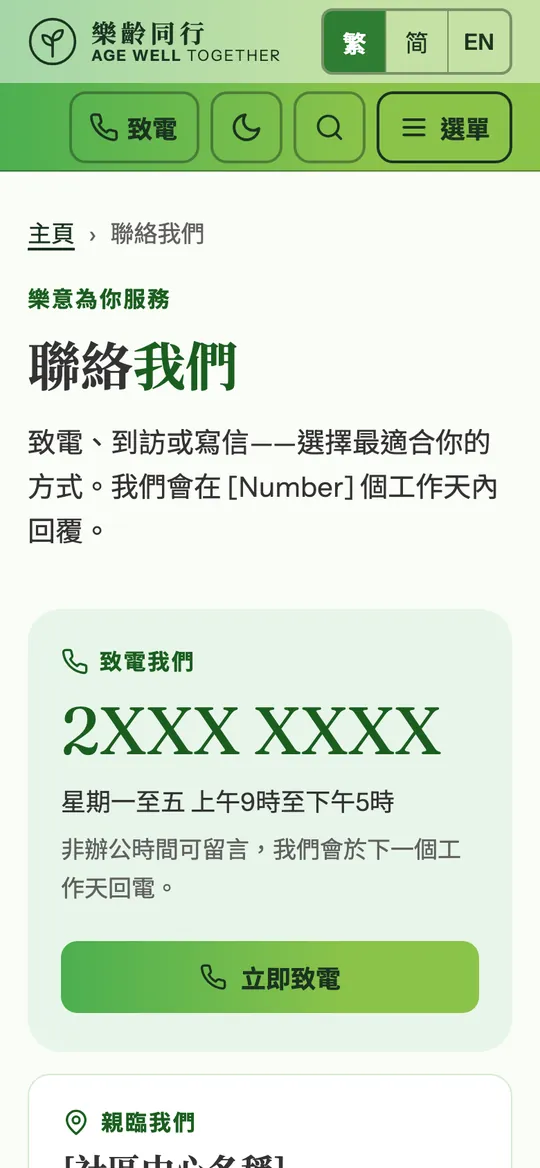
Hotline first, then e-mail, address, map, a short enquiry form and FAQs.

Boards: T11 Contact, desktop + mobile

Illustrative mockup — Contact page at desktopIllustrative mockup
Illustrative mockup — Contact page at mobileIllustrative mockup
Requirement 11: Search results

Asked: 不需要完整設計 · Full design not required不急 · Not urgentConcept drawn

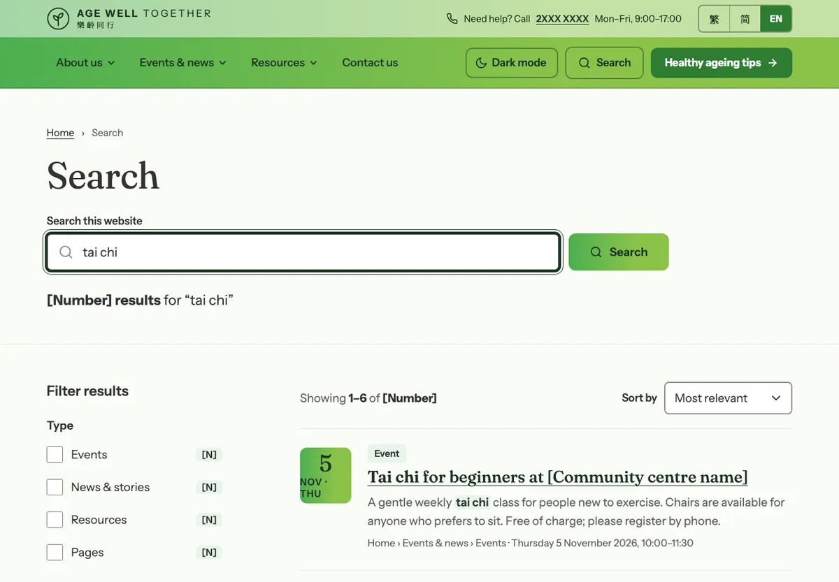
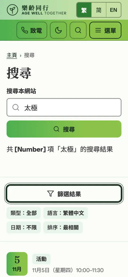
Results grouped by type, with a helpful empty state.

Boards: T12 Search results, desktop + mobile

Illustrative mockup — Search results page at desktopIllustrative mockup
Illustrative mockup — Search results page at mobileIllustrative mockup
Requirement 12: 404

Asked: 不需要完整設計 · Full design not required不急 · Not urgentConcept drawn

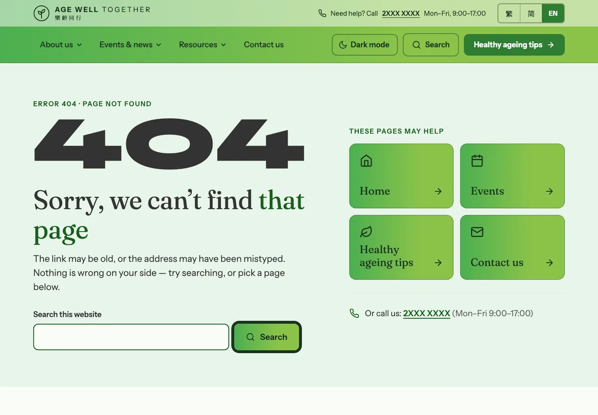
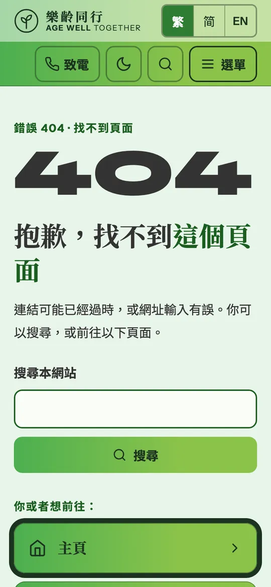
Says it is not the reader’s fault, offers search, four big links and the hotline.

Boards: T13 Error 404 / 500, desktop + mobile

Illustrative mockup — Error 404 page at desktopIllustrative mockup
Illustrative mockup — Error 404 page at mobileIllustrative mockup
3 · The pages — components

Every piece, in every state.

The building blocks behind all of the pages above.

Requirement 13: UI / accessibility components

Asked: High-fidelity sample做 · RequiredConcept drawn

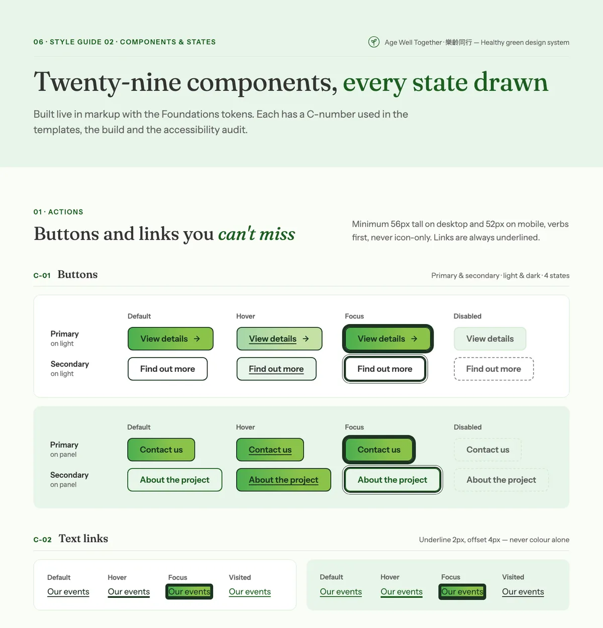
Twenty-nine components, each drawn in every state: default, hover, focus and disabled.

Boards: 06 Style guide 01 Foundations and Style guide 02 Components & states, plus their continuations

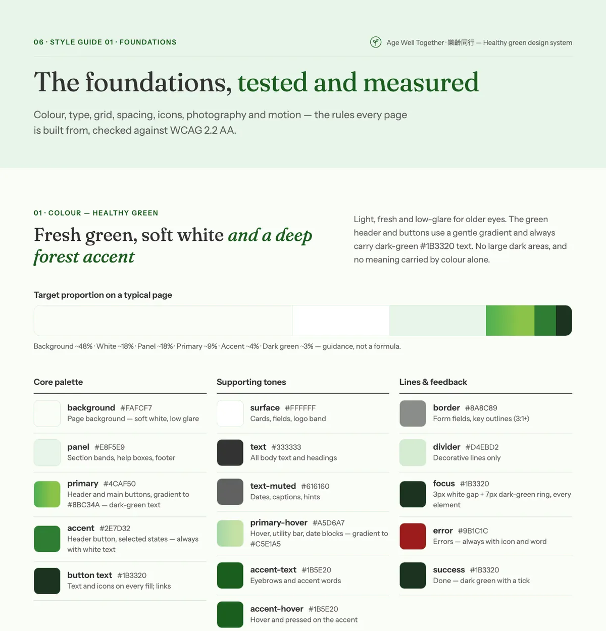
Illustrative mockup — Style guide 01 Foundations: the healthy green palette and tested colour pairingsIllustrative mockup
Illustrative mockup — Style guide 02 Components & states: buttons and links in default, hover, focus and disabledIllustrative mockup
4 · The system · Design System v1.0

A proper design system, not just a homepage.

Every page above is built from one set of rules, so a new page looks right the first time and a build team would start from the same files the design was made from.

Colour — healthy green

  • Primary
    #4CAF50 → #8BC34A
    Header and main buttons
  • Accent
    #2E7D32
    Selected states, always white text
  • Button text
    #1B3320
    Text and icons on every fill
  • Panel
    #E8F5E9
    Section bands, help boxes
  • Background
    #FAFCF7
    Soft white, low glare
  • Text
    #333333
    Body text, 12.2:1 on background

The design pack

  • Design System v1.0 document (Traditional Chinese)
  • Design tokens file — colours, type, spacing
  • Desktop and mobile high-fidelity mockups
  • Desktop and mobile wireframes
  • Editable SVG and Figma-oriented design packages
Typography
Fraunces headings, Instrument Sans for reading, Noto Serif / Sans HK and SC for Chinese. Body 20px on desktop, 18px on mobile; nothing below 16px.
Layouts
Desktop 1440 (12 columns, margin 80), tablet 834 (8 columns), mobile 390 (4 columns, margin 20).
Spacing
A ten-step scale from 4 to 120. Section padding 120 on desktop, 64 on mobile.
Touch targets
48px preferred, 44px minimum, on every control.
Components
29 reusable components — buttons, links, cards, menus, forms, carousel, lightbox — each with a C-number.
Navigation
Multilingual: the 繁 · 简 · EN switch is in every header and menu.
States
Default, hover, focus and disabled drawn for every component; a 3px dark-green focus ring with a white gap.

5 · Accessibility · target WCAG 2.2 Level AA

Accessibility intentions, not a certification.

No formal WCAG certification is needed at tender stage. What the tender needs is how the design will meet the standard — below, requirement by requirement. These are design intentions, not test results: conformance is tested on the built website, with an accessibility conformance report before UAT.

How the concept meets each accessibility requirement
RequirementHow the design meets it
WCAG 2.2 AA design targetEvery template is drawn against Level AA, including the six criteria new in 2.2: focus not obscured, dragging alternatives, target size, consistent help, redundant entry, and accessible authentication (no CAPTCHA or puzzles).
Accessible colours and contrastPalette text pairs checked at 4.5:1 or better on the design files (body text 12.2:1). A high-contrast mode. Links are underlined, so colour is never the only signal.
Senior-friendly typographyBody text 20px on desktop and 18px on mobile, nothing below 16px. A text-size control, plain language, and Noto Sans / Serif HK and SC for Chinese.
Keyboard-accessible navigationA skip link, a keyboard path through every menu, and a visible 3px dark-green focus ring with a white gap. The menu works with JavaScript off.
Mobile responsivenessEvery template drawn at desktop 1440 and mobile 390, on a 12 / 8 / 4-column grid (1440 / 834 / 390). Touch targets 48px, never under 44px.
Accessible interactive components29 components, each drawn in default, hover, focus and disabled states. Carousels start paused, icon-only controls have screen-reader names, and language is marked on every Chinese and English phrase.
Final accessibility testingNot part of this concept. If awarded, the built website is tested and an accessibility conformance report is provided before UAT.

Out of scope, on purpose

An information site, kept that way.

To avoid scope creep, these are left out by design.

  • User accounts and login

    None for the public. Only staff sign in, to the CMS.

  • Online event sign-up

    Event pages show how to join — call, visit or ask.

  • Surveys and assessments

    Nothing is collected on this site.

  • Chatbot or AI features

    Help comes from the hotline, the form and FAQs.

  • AI text-to-speech

    No “Listen to this page” or other machine-generated speech. Visitors can still use the screen reader or read-aloud built into their own device.

  • Logo and name

    The “Age Well Together · 樂齡同行” name and mark are placeholders, not an approved brand.

  • Shop, donations, forums

    The site informs and presents.

Work with us

Planning a website for older people?

We design and build accessible, multilingual public websites — from the sitemap to the CMS. Ask us to walk you through the full concept.